Forecasting the Weather
Forecasting the weather is very difficult. How many times have you complained that a TV weather forecast was all wrong? Have a go at some of the activities below and see how close you get to a correct prediction!
It is interesting to find out about the weather symbols that are used on weather maps. They come in all sorts of designs, but hopefully they are similar enough to understand.
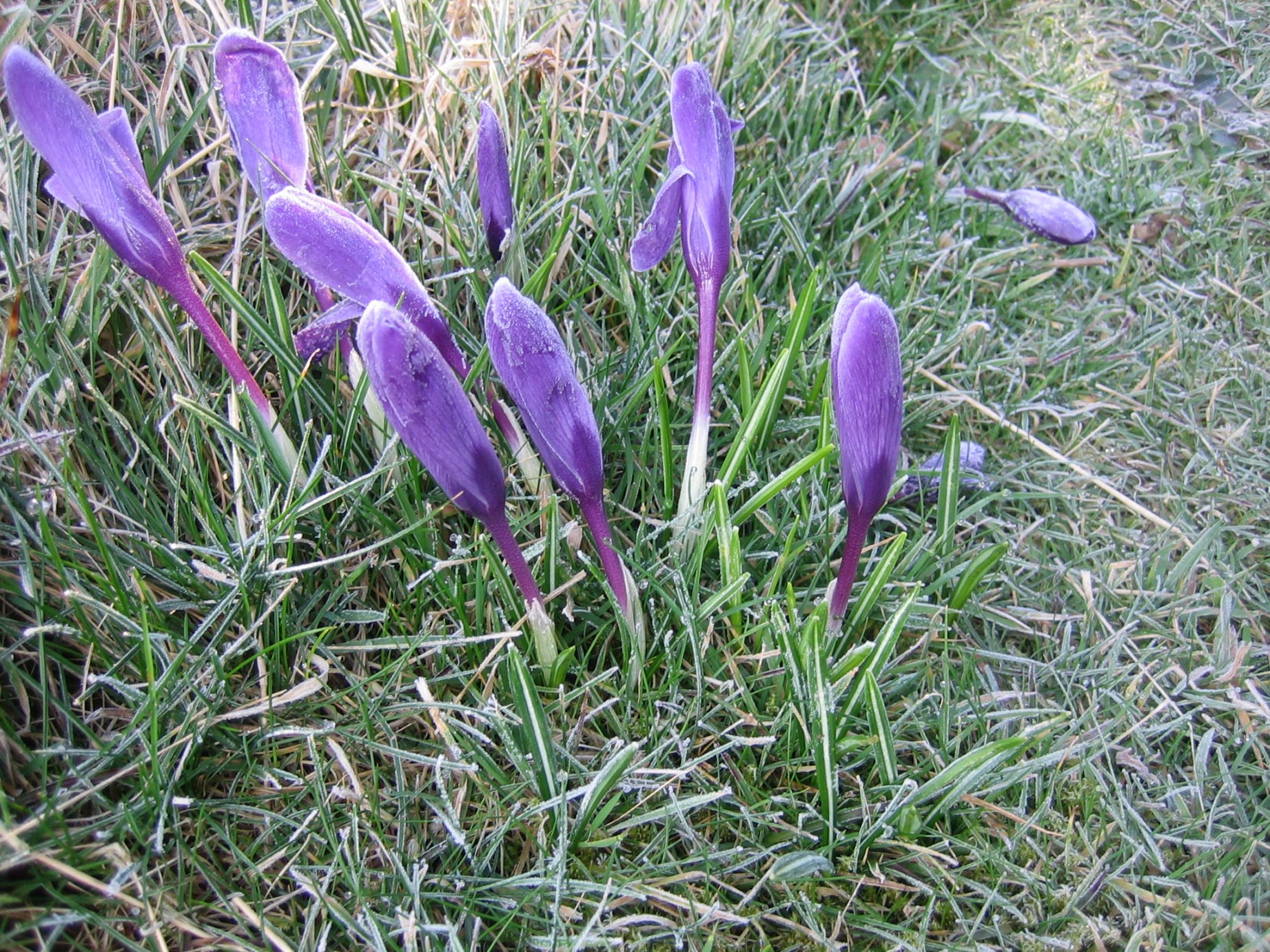
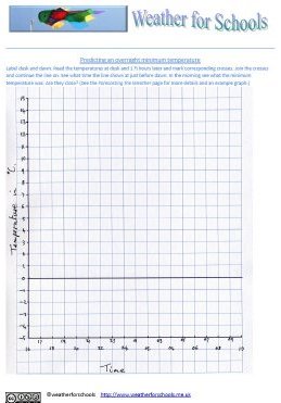
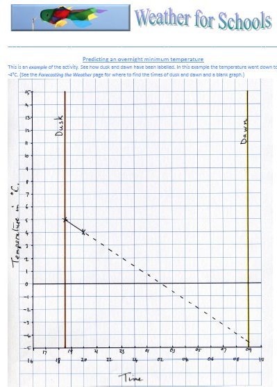
To predict if there will be a frostFrost can be very pretty but it also can cause problems. Some plants need to be protected from the frost; otherwise they may die, or loose flowers or leaves. Some of the crocuses on the right have been affected by the frost. Newly laid concrete will be damaged by frost too. Car windows can be covered in ice. If you want to know if it will be frosty try out this method to predict and see how well it works. It is best done when the sky is clear, with no clouds. It is also works best when there is little wind. |
 |
Materials
|
 |
Method
|
|
Your Results To make it a fair test repeat this experiment several times. Do remember that dawn and dusk times change every day so you will need to look them up for the day you are doing your next temperature measuring on. See if there is a pattern. |
 |
Persistence ForecastA persistence forecast suggests that often the weather on one day is the same as it was on the previous day. Some descriptions say that 70% (or seven out of every ten days) have the same weather as the day before. Other reports say that 40% of the days will be the same. That is equal to two out of every five days. You could do an investigation to find out what the total would be in the data you choose to investigate. |
An example of highlighting in the spreadsheet. |
Materials
|
 |
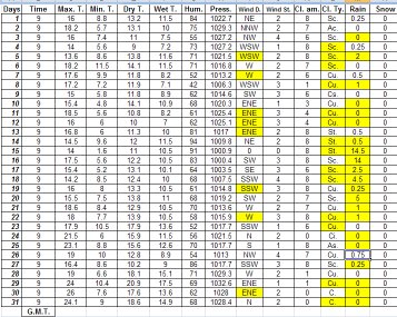
Method Choose which weather data you are going to look at. If it rains at all, that might count as a rainy day. See how many days of rain follow one another. You could try to do the same with wind direction and cloud type. Use the marker pen to highlight all of the readings that are the same as the day before. Count and write down the total number of entries that you have checked. Count and write down how many are highlighted. Work out the what the percentage of days that are the same is. This would be the days that were the same x the total number of days, divided by 100. In the May 2009 example the days when the same weather occurred as the day have been highlighted. There were 31 days. There were 8 examples of the same wind direction (25%). There were 14 examples of the same cloud type (45%). There were 21 days when rainy or dry day followed each other (68%). What do you think this shows? |
|
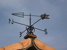
Wind Rose ForecastThe place that the wind comes from often sends its weather along with the wind. If you look on a map and find your location, then look in the different directions it is easy to guess what weather each wind might bring. The Wind Map of Tamworth can be explored to see what weather each wind might bring to Tamworth. You could make a map like this centred on your location anywhere in the world. Notes on how to create a Custom Google Map can be found on the Weather Round the World page. |
 |
To carry out your own wind rose investigation look at the resources on the Wind Direction and Wind Roses page. Remember that when you do an experiment it is best to repeat it several times. The weather is very complicated, there are lots of things which affect it. Wind is only one of the variables. |
|